How to Correctly Setup SRCSET and Sizes for AMP-IMG
What Will I Learn?
This tutorial demonstrates how to correctly use srcset and sizes for responsive amp-img and explains the logic behind it.
Requirements:
- Basic CSS & HTML knowledge;
Useful links:
- Working example: www.centrumhotels.com
An example of AMP-IMG with SRCSET and Sizes
The code itself can be pretty self-explanatory but if you want to dig deeper and fully understand the logic behind these amp-img settings, I highly recommend reading the whole tutorial.
|
1 2 3 4 5 6 7 8 9 10 11 |
Explanation of AMP-IMG SRCSET
At the first sight it might look like srcset defines which image to use at which breakpoint but that is not the case. Instead, srcset defines the width of the image and then the browser decides which source to use. The difference might look small but is important to understand because you are not entirely in the control. For example, if browser has a bigger version of the file already downloaded, it will use it instead of what is pointed out in the code.
The browser also going to take pixel density into the formula.
|
1 2 3 4 5 6 7 8 9 10 |
An example with four different image sizes pointed out via srcset to amp-img with src for the browsers without srcset support.
Explanation of AMP-IMG Sizes
It is hard to understand sizes correctly if you don’t understand how does srcset work. Compared to CSS breakpoints, the main advantage of srcset comes into play once you start using sizes. It defines the width of amp-img. The basic implementation of sizes is not that hard.
|
1 2 3 4 5 6 7 8 9 10 11 |
Now the browser knows that the width of amp-img is 25% of the whole screen width and it will pick the best srcset image for it. The browser will use this formula to choose the right fit.
|
1 |
= / 100 * 25 |

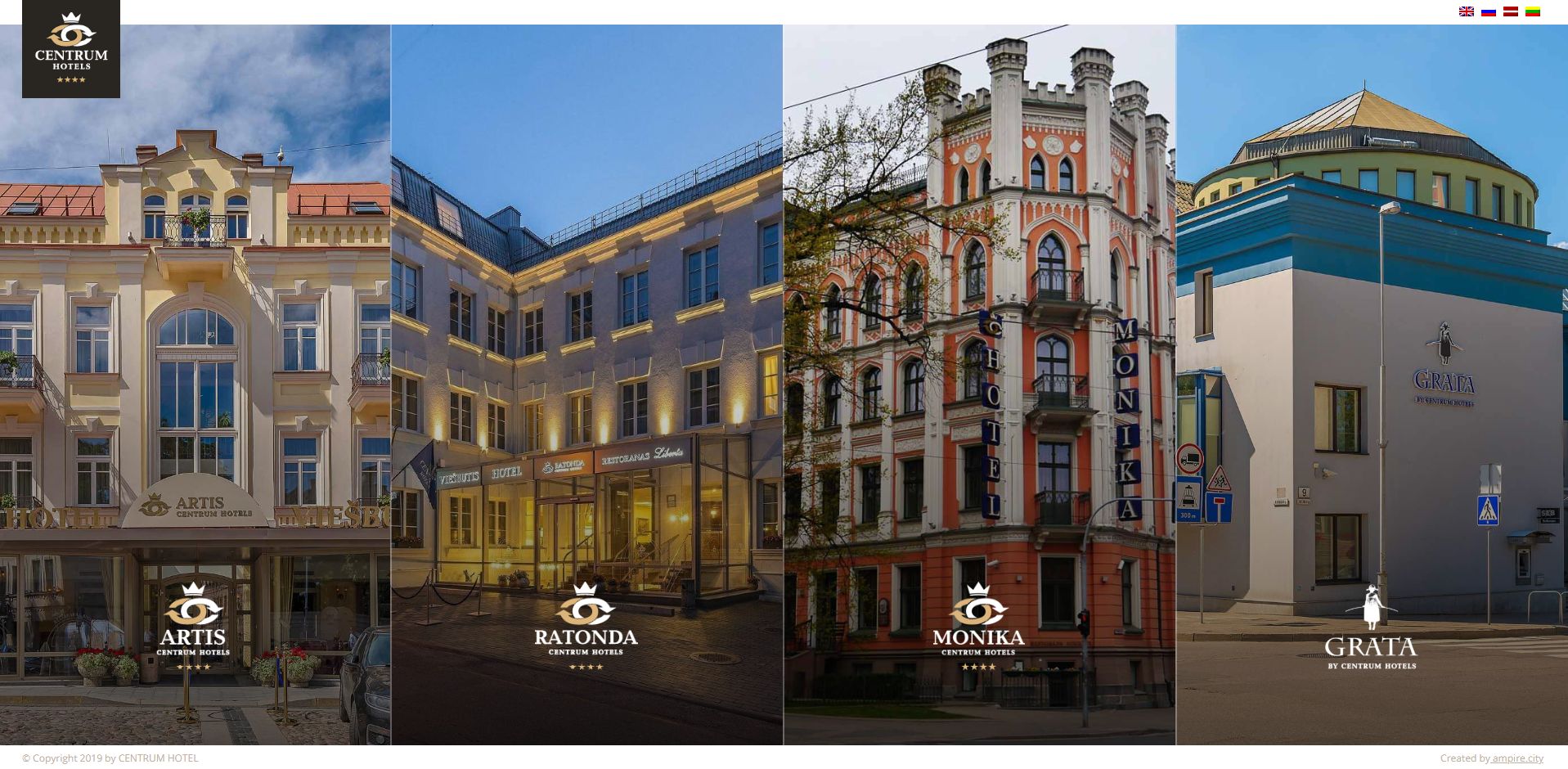
centrumhotels.com on 1920px desktop screen
It works well for larger screens but the common design practice is that many elements will collapse to 100% width on tablet and mobile devices. Just like in this example:


centrumhotels.com on 960px desktop screen
As you might note, sizes not only points out the width of the image but also defines it. This problem could be easily solved with sizes because it supports the breakpoints. Simply change sizes code with the following line and the browser will start picking the right image for tablet and mobile devices.
|
1 |
sizes="(min-width: 1024px) 25vw, 100vw" |


centrumhotels.com on 960px desktop screenHaving all that in mind you should be able to properly setup amp-img for responsive website on all screen sizes.
Adding a Breakpoint to AMP-IMG Sizes
If you still have problems implementing responsive images via amp-img, feel free to contact me.
Originally posted on 3/18/2020
Versions:
WordPress 5.3.2
AMP 1.4.4